Listing
Description
- Type name:
listing- Optional widget
- Placement type: auto
Provides a list of articles.
For example, widget can be used for Main page, Category page - to show the latest posts/articles. Also can be placed below article widget to show “related articles” or similar lists.
Design [required]
Supported values:
| Value | Description | Demo |
|---|---|---|
image_position_left |
Small images, left-aligned | 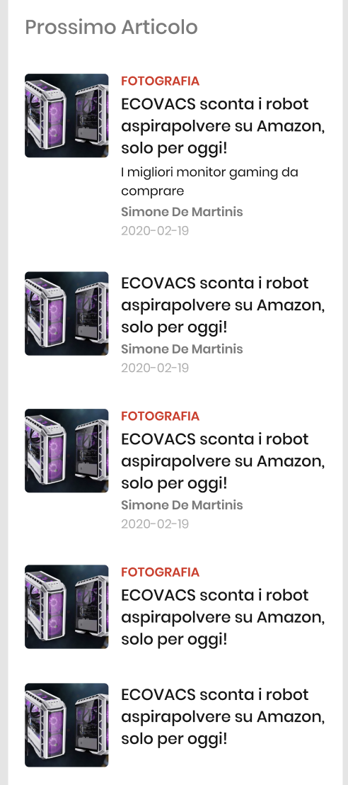 |
image_position_right |
Small images, right-aligned |  |
image_position_center |
Centered images, aligned to the edges of the content |  |
image_position_center_big |
Centered big-size images, aligned to the edges of the content |  |
full_width_images |
Centered images, stretched to the full width of the viewport | 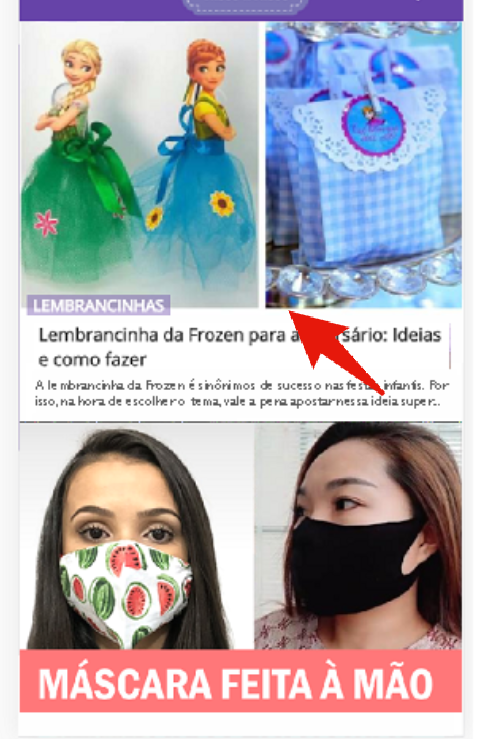 |
two_columns |
List items displayed in 2 columns |  |
images_with_text |
List of images in 1 column, with overlay text |  |
ticker |
List items displayed as an animated ticker |  |
short |
Compact listing layout |  |
slider |
Fixed step slider, slides with swipe or tap on prev/next buttons | 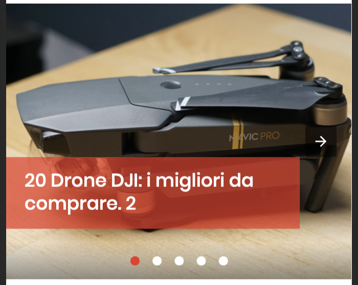 |
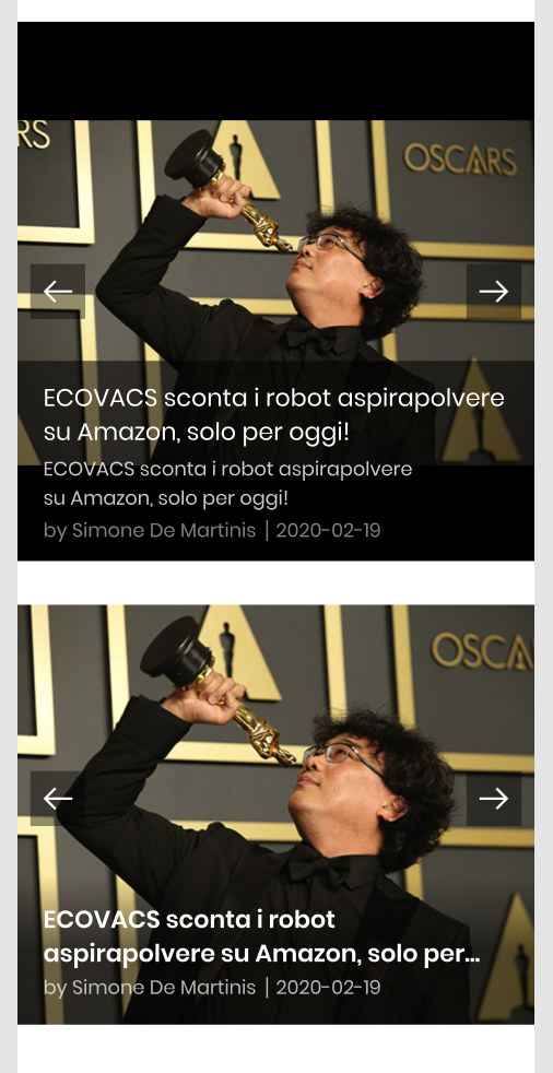
slider_drag |
Ribbon-slider, siding by dragging | 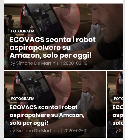 |
slider_overlay |
Like slider but with additional text overlay |
 |
slider_fit_text |
Like slider_overlay but text placed below images (not overlay) |
 |
slider_short |
Compact slider without images |  |
photo_gallery |
List items displayed as photo gallery with prev/next links |  |
tile |
List items displayed as tiles |  |
ListingTitleText [optional]
Title text, on the page showing above first listing item.
ListingTitleUrl [optional]
Url for ListingTitleText (if exists).
ListingTitleDesign [optional, default: default]
Supported values:
| Value | Description | Demo |
|---|---|---|
default |
Simple text title | 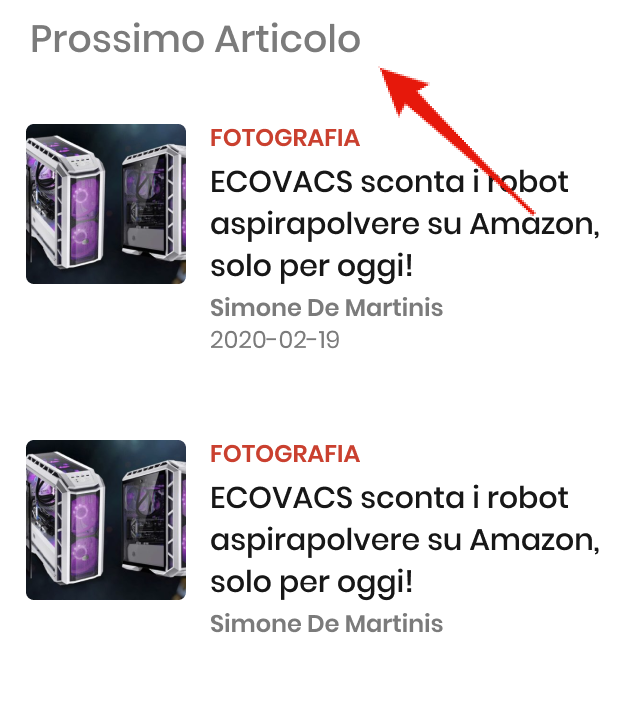 |
overlay |
Title overlaid on the first element’s image |  |
corner |
Title with corner-style background |  |
ListingTitleUppercase [optional, default: true]
Uppercase ListingTitleText (if exists).
ShowItemTitleAboveImage [optional, default: false]
Shows the item title above image.
Available for Design:
image_position_center, image_position_center_big, full_width_images
CategoryUppercase [optional]
Uppercase item category (if exists).
FirstItemHighlight [optional, default: false]
Highlights the first item (big image or vertical color line, depending on design chosen).
Available for Design: image_position_center, image_position_center_big, full_width_images, images_with_text, tile
FirstImageFit [optional, default: cover]
In this property you can chose how the first listing item is positioned inside the parent element.
Available values: cover, contain, fill, none.
See more about object-fit values.
Available for Design: image_position_center, image_position_center_big, full_width_images, slider_drag, two_columns, tile.
ImageFit [optional, default: cover]
Images are fit to fixed size parent block element.
In this property you can chose how all listing items, except the first one, are positioned inside the parent element.
Available values: cover, contain, fill, none.
See more about object-fit values.
Available for Design: image_position_left,
image_position_center,
image_position_right,
image_position_center_big,
slider_drag,
slider_overlay,
slider_fit_text,
slider,
full_width_images,
two_columns,
images_with_text,
photo_gallery,
tile.
FirstImageFitHorizontalPosition [optional, default: center]
FirstImageFitVerticalPosition [optional, default: center]
You can change image vertical/horizontal position logic for the first item.
Available values for FirstImageFitHorizontalPosition: center, left, right.
Available values for FirstImageFitVerticalPosition: center, top, bottom.
See more about object-position values.
Available for Design: image_position_center, image_position_center_big, full_width_images, slider_drag, two_columns.
ImageFitHorizontalPosition [optional, default: center]
ImageFitVerticalPosition [optional, default: center]
You can change image vertical/horizontal position logic for all other items.
Available values ImageFitHorizontalPosition: center, left, right.
Available values ImageFitVerticalPosition: center, top, bottom.
See more about object-position values.
Available for Design:
image_position_left,
image_position_center,
image_position_right,
image_position_center_big,
slider_drag,
slider_overlay,
slider_fit_text,
slider,
full_width_images,
two_columns,
images_with_text,
photo_gallery,
tile.
EnableShareFacebook [optional, default: false]
EnableSharePinterest [optional, default: false]
EnableShareTwitter [optional, default: false]
EnableShareWhatsapp [optional, default: false]
Enable social sharing buttons for each listing item.
FacebookAppId [optional]
Facebook AppId, if "EnableShareFacebook": true.
How do I get a Facebook Application ID?.
SliderAutoplay [optional, default: false]
Enable automatic sliding in the slider listing designs.
Available for Design: slider_fit_text
SliderAutoplayDelay [optional, defaut: 5000]
Delay between automatic sliding in ms, if "SliderAutoplay": true
Available for Design: slider_fit_text
Items [required]
Array of items.
Url [required]
Valid Url for the item link.
Title [required]
Listing item title.
Description [optional]
Listing item description text with HTML markup.
CreatedDate [optional]
Content creation date.
Format: ISO 8601.
CategoryName [optional]
Name of the listing item category.
CategoryUrl [optional]
Link URL for listing item category, if CategoryName is present.
Info [optional]
Listing item additional information text with HTML markup.
Image [optional]
Standard Image object structure to provide listing image.
Author [optional]
Standard Author object structure to provide author info. Only one author instance allowed.
JSON example
[{
	"Type": "listing",
	"Id": "abcABC123",
	"Design": "slider",
	"ListingTitleText": "Politics",
	"ListingTitleUrl": "https://yoursite.com/section/page/",
	"ListingTitleDesign": "default", // default / overlay = listing_title_alternative / corner = listing_title_corner_design
	"ListingTitleUppercase": true, // listing_title_uppercase
	"ShowItemTitleAboveImage": false, // enable_heading_up
	"CategoryUppercase": true,
	"FirstItemHighlight": true,
	"FirstImageFit": "cover",
	"FirstImageFitHorizontalPosition": "center",
	"FirstImageFitVerticalPosition": "center",
	"ImageFit": "cover",
	"ImageFitHorizontalPosition": "center",
	"ImageFitVerticalPosition": "center",
	"EnableShareFacebook": true,
	"FacebookAppId": "",
	"EnableSharePinterest": true,
	"EnableShareTwitter": true,
	"EnableShareWhatsapp": true,
	"SliderAutoplay": false,
	"SliderAutoplayDelay": 5000,
	"Items": [
		{
			"Url": "https://yoursite.com/item/page/",
			"Title": "Lorem ipsum dolor",
			"Description": "Lorem ipsum dolor sit amet, consectetur adipiscing elit. Curabitur interdum, nisl quis facilisis sollicitudi, tellus metus fringilla dolor, eu porta libero mauris finibus metus. Quisque pulvinar mattis sagittis.",
			"CreatedDate": "2020-08-03T12:36:26",
			"CategoryName": "Politics",
			"CategoryUrl": "https://yoursite.com/section/page/",
			"Info": "Optional text string",
			"Image": {
                "Src": "https://yoursite.com/images/hero-full.jpg",
                "Width": 1500,
                "Height": 844,
                "Alt": "Alt text"
            },
			"Author": [{
                "Name": "John Doe",
                "Url": "https://yoursite.com/author/page/",
                "Description": "Author description text",
                "Image": {
                    "Src": "https://yoursite.com/images/author/avatar.jpg",
                    "Width": 1500,
                    "Height": 844,
                    "Alt": "Alt text"
                }
            }]
		}
	]
}]
Demo
See Design property